Histograms
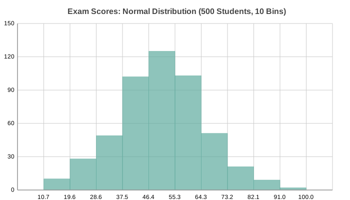
Histogram showing value distribution across evenly-spaced bins. Useful for understanding the shape of data distributions, identifying skewness, and finding outliers.
Basic Usage
Create a histogram from raw data:
from charted.charts import Histogram

chart = Histogram(
    data=[1.2, 1.5, 2.1, 2.3, 3.1, 3.5, 4.0, 4.2, 5.1, 5.5],
    bins=5,
    title="Data Distribution",
)
chart.save("histogram.svg")
Auto-Binning
When bins is omitted, the library uses Sturges’ rule to determine
a sensible number of bins based on the data size:
chart = Histogram(
    data=[1.2, -0.5, 3.4, 2.1, -1.8, 0.9, 4.1, 3.0, 2.7, 1.8],
    title="Auto-Binned Distribution",
)
Customizing Bins
Specify exact bin count for finer or coarser granularity:
chart = Histogram(
    data=[1, 3, 2, 5, 4, 7, 6, 9, 8, 8],
    bins=10,  # More bins = more detail
    title="Fine-Grained Distribution",
)
Custom Colors
Override the default color:
chart = Histogram(
    data=[1, 2, -3, 4, -2, 3, -1, 5],
    bins=6,
    theme={
        "colors": ["#E74C3C"]
    },
    title="Red-Toned Histogram",
)
API Reference
- class charted.charts.histogram.Histogram(*args, **kwargs)[source]
Bases:
ChartParameters:
data: Single flat list of numeric values to binbins: Number of bins (auto-computed if None)labels: Optional x-axis labels (auto-generated if omitted)width: Chart width px (default 800)height: Chart height px (default 600)theme: Theme dict or stringtitle: Chart title
Example:
from charted import Histogram

chart = Histogram(
    data=[1, 2, 1, 3, 5, 4, 3, 2],
    bins=5,
    title="Value Distribution",
)
chart.save("histogram.svg")
- Parameters:
- property representation: G
Render histogram bars aligned to the continuous bin-edge x-axis.
Each bar spans from x_axis.coordinates[i] to x_axis.coordinates[i+1], so bar left edges sit on the bin-edge ticks and bar width equals the tick spacing.